

Introducing Market->Macro Mapping
Our method for extracting the market’s "macro view"

For many years I’ve been using various statistical techniques to map cross asset returns on to macro variables, with the aim being to track what macro view the market is pricing off.
Some results of a comprehensive rebuild of that method are presented here.
Headlines - the cross asset returns indicate:
above trend growth going into Q3 (Q2 pegged at 3% annualised US GDP growth and current 5 day MA of GDP at 4.8% ) and a turn higher in profit growth
an inflation “premium” in both headline and core - presumably due to tariff risks. This normally resolves in a matter of months. Either actual data will rise to meet the market view or the market will need to mark down inflation expectations fairly significantly.
at the same time an easing of supply conditions over recent months (leaving aside the tariff shock) is indicated which is distinctly odd. This isn’t a “soft landing” given the above trend growth view but is pretty benign.
Pretty steady Fed expectations on a cross asset basis (if not bond market basis) and pretty clear risk premium in DXY
As such the market is primed for growth disappointments - labour market slowdown is happening? - or good news on inflation.
We will continue exploring and presenting interesting takes from this novel new data set.
Our approach uses daily returns and levels across a variety of markets (rates, credit, equities, FX and oil) to extract a set of latent variables that appear to fit macro economic data well.
While we shouldn’t be too literal about transposing market returns to macro expectations this does seem to be a pretty useful tool in a number of ways: is the market telling us anything interesting re the macro outlook versus consensus, our own expectations (otherwise, what is our edge?) and is the market’s view internally consistent.
This time I will simply set out a few highlights about what the market appears to be saying right now (pre June NFPs) with more to come in future publications.
The first chart looks at the 5 day moving average on daily data for US GDP and CPI (all at annualised rates) year to date.
Chart 1: Daily Data for US GDP and Headline CPI (at annual rates)
Two things to note. The tariff threat was perceived as a supply shock with market implied growth expectations falling very hard while market implied inflation increased. Similarly, we saw an increase in inflation expectations after the Israeli attacks on Iran but a much more moderate decline in growth.
The really big change in the last two weeks has been the apparent decline in inflation expectations rather than a large increase in growth (albeit it is up).
This is important. Switching to a monthly view shows why.
The two charts below compare annualised monthly core and headline CPI inflation in the US vs the market implied measure.
Chart 2: Monthly Data for Core CPI (at annual rates)

Chart 3: Monthly Data for Headline CPI (at annual rates)
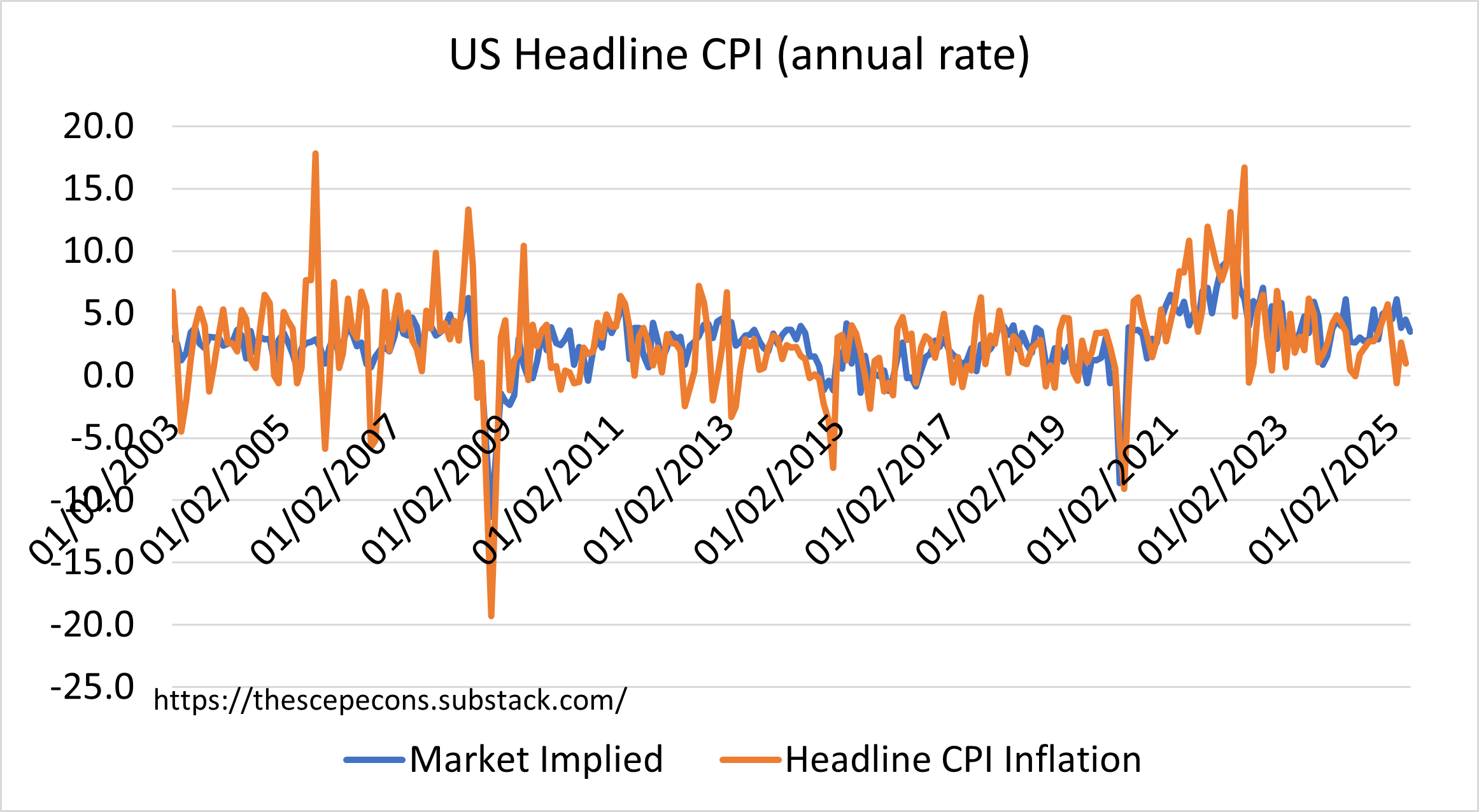
Our market measures for core and headline have not come down in line with the recent decline in the m-o-m rates of the actual data. This is sensible since the monthly changes are noisy and it appears the market looks through or averages out some of that monthly noise. In this case however the gap is unusually persistent as can be seen by looking at the gap between the market implied headline and core numbers against the actual reported data.
Chart 4: Monthly Data for Inflation Spread to Actual (at annual rates)

It’s obvious from this chart that the spread between the market and the actual mean reverts to zero with a half life measured in only a few months. This sets us up for a change over the next 3 months or so.
Either the market is right to be sceptical about the recent good news on inflation implying actual data coming in higher (back towards 4%) or the market will mark down it’s inflation expectations by a consequential amount.
Clearly, this is an inflation risk “premium” related to uncertainty about the size and impact of tariffs. Its notable, then, that market headline inflation expectations have fallen so much over the past couple of weeks. If this persists bonds will, obviously, continue their good run and risk assets will continue to be happy.
However, the daily data decline in headline inflation expectations isn’t being reflected in core. So far the fall is completely driven by oil price declines rather than the pricing out of tariff risks to the inflation environment.
Chart 5: Headline CPI vs WTI Oil Price Change
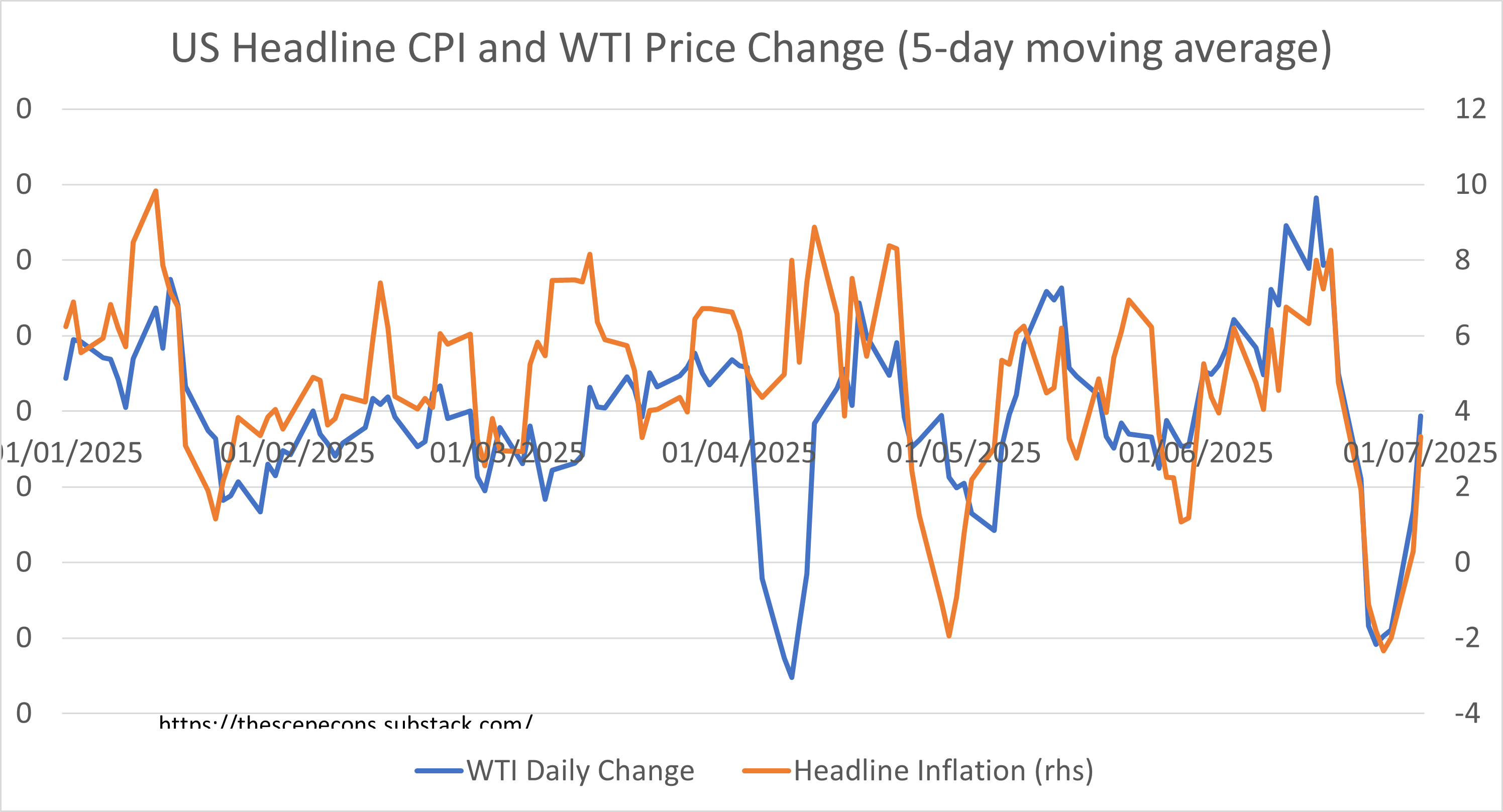
Given oil prices have - seemingly - stabilised the boost to rates returns, change in Fed pricing, and by extension positive risk asset returns from this channel will fade. It’s back to tariff watching and the underlying performance of growth, capacity and inflation.
The market continues, despite all the noise, to price in a) slightly above trend GDP growth (3% annualised for Q2 and accelerating into Q3, post the Iran attacks) and b) a turn higher in real profit growth.

This is a tad surprising. Macro measures of economic slack indicate that corporate operational gearing is limited so that any top line revenue growth makes a smaller contribution to profit growth than it does when coming out of a recession or in mid-cycle periods.
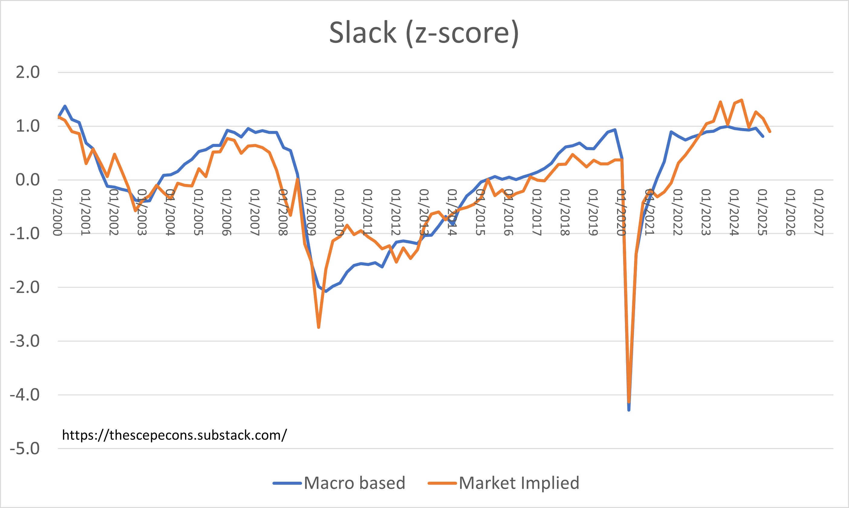
Intriguingly, the market’s implied measure of slack is moving down, ie the market is acting as if capacity constraints are easing from their peaks. Combining this with above trend growth expectations indicates the market is pricing in an increase in capacity or to put it another way improving supply conditions.
The market is indicating a better than soft landing - easing supply pressures and continued above trend growth. That seems unusual to say the least! True, the unemployment rate is up (and expected to increase again in the NFP release this week) and the Fed is priced to ease in the rates market, but supplier delivery times are extending possibly due to tariff disruption.
At the same time as the market is anticipating easier supply conditions it is retaining a tariff inflation risk premium. These two views cannot go hand in hand for long.
Either growth is above trend implying the labour market and slack will firm again validating the market’s sticky inflation response. In that world Fed easing is off the table. If however the increase in slack being priced in does in fact lead to slower demand then the inflation premium will, one presumes, drop out leading to a healthy fall in bond yields. Profit growth expectations are being boosted by the markets outlook for healthy growth mixed with declining cost pressures. That is an unusual combination.

In fact a measure of the stance one measure from the data set for monetary policy has been easing since peaking around the tariff shock. And DXY has moved with it, just by more than the historic relationship would suggest.
So, a plethora of internal inconsistencies to clarify over the next quarter: sticky inflation or not, tariff shock or not, the softest of soft landings with profits increasing with unemployment at 4.2%?